# Week 4: Design Foundations
Agenda
- Week 4 Tutorial Files (opens new window)
- App Comparison PDF
- Style vs Design
- CRAP design
- Gestalt Principles
- Colour Theory
- Psychology of Design
- Typographic Hierarchy
- Guidelines & Best Practices
# Style vs Design
Style can be very subjective. What appeals to one person may not appeal to another. Style can be appealing or non-appealing.
Design can be good or bad. Their are guidelines and rules that you can learn and follow. Expert designers have learned which guidelines and rules that they can bend or break under which circumstances.
You can learn to be a good designer. Pay attention to details. Follow the rules. You may not be ground breaking but your users will feel comfortable with your websites and apps.
Bad designers do things randomly. They fall back on their own style. They use the colours and fonts that appeal to them. They say things like "I love this shade of green and this shade of orange so I am going to use both of them as my website colour scheme.
# Examples of Good Design
There are lots of great places to find good examples of web design. Here are the two places I usually start when looking for some ideas:
- Dribble (opens new window)
- Awwwards (opens new window) - note the stuff on here often gets nominated because it does something technically interesting or unique, not because its necessarily great design. Explore with a critical eye!
# Want to practice your CSS skills?
Try to replicate some of their designs using HTML and CSS.
# C.R.A.P. Design
CRAP is an acronym that stands for Contrast, Repetition, Alignment, and Proximity. They are rules that you should follow when designing your layout for your webpages. You should always keep these principles in mind when designing and reviewing your webpage.
A very well known book about CRAP design is called "The Non-Designers Design Book" by Robin Williams. (Not THAT Robin Williams).
Here is a short video series on the CRAP design plus WhiteSpace. This is a really good series for beginners about design. It was in the To Do list of videos from last week. Keep coming back to these for ideas and for confirmation that you are designing your webpages and apps following the rules.
Beginning Graphic Design: Fundamentals (opens new window)
Beginning Graphic Design: Colour (opens new window)
Beginning Graphic Design: Composition and Layout (opens new window)
Beginning Graphic Design: Typography (opens new window)
# Gestalt Principles
Gestalt Psychology tells us that the whole is different than the sum of its parts.
If you took a pizza, cut into eight slices and you separated all the pieces slightly, so that they were no longer touching, then you would still see the circle that is implied by the round edges on the outsides of the triangles.
There are 6 main principles that make up Gestalt psychology:
- Continuation
- Similarity
- Closure
- Proximity
- Symmetry
- Figure & Ground
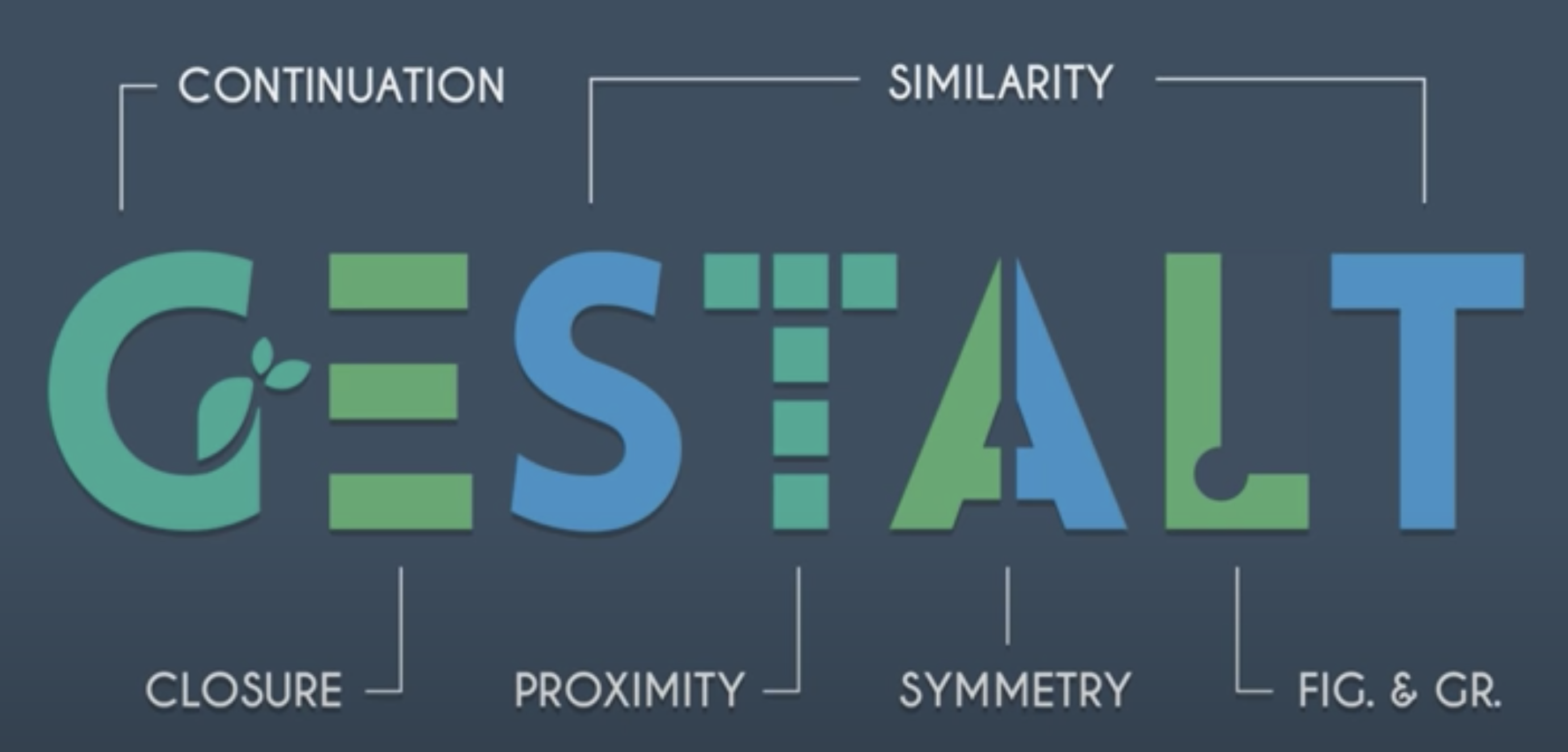
This image comes from This YouTube video from the week 3 To Do list (opens new window)
These principles all influence the way that people will see your webpages.
You do not need to become an expert in this. You do not have to memorize the list.
However, you DO need to understand how these work.
# Colour Theory
When it comes to colour there are a few simple rules to remember.
- Every colour carries meaning and a mood or feeling.
- The mood of your colour should match the mood or feeling of your website subject matter.
- Every aspect of your design should be sending the same message as the colour.
- Colours are like musical notes. They have a frequency. Some notes/colour combinations are harmonious and others are jarring.
- Accessibility should always be at the top of your list of questions about your colours.
- You ALWAYS need to have strong contrast between the foreground (text) and background.
- The less contrast you have, the bigger the font-size needs to be.
- Just like choosing font-families, limit the number of
huesin your colour scheme. Twohuesis often enough. Usesaturationorlightnessto vary the colours slightly on your pages.
# Psychology of Design Terms
- Hick's Law - Hick’s Law predicts that the time it takes to make a decision increases with the number and complexity of choices available.
- Cognitive load - refers to the mental processing power being used by our working memory. Our brains are similar to computer processors in that we have limited processing power: when the amount of information coming in exceeds the space available, cognitive load is incurred.
- Too many choices will increase the cognitive load for users.
- Break up long or complex processes into screens with fewer options.
- Use progressive onboarding to minimize cognitive load for new users.
- Miller's Law - predicts that the average person can only keep 7 (± 2) items in their working memory.
- Don’t use the “magical number seven” to justify unnecessary design limitations.
- Organize content into smaller chunks to help users process, understand, and memorize easily.
- Jakob's Law of Internet User Experience - users spend most of their time on other sites, and they prefer your site to work the same way as all the other sites they already know.
- Users will transfer expectations they have built around one familiar product to another that appears similar.
- By leveraging existing mental models, we can create superior user experiences in which the user can focus on their task rather than learning new models.
- Minimize discordance by empowering users to continue using a familiar version for a limited time.
Full Article: Psychology of Design (opens new window)
# Typographic Hierarchy
If you see something that could be a threat, like a lion, the bigger that thing is then the more attention you will pay to it. If the lion is so small that you can barely see it then you will not be too worried. If the lion is the same size as your hand held at arms length then it is time to worry. If the lion's relative size is getting larger then you will really be paying attention to that.
The same rules apply to typography. Big fonts get more attention than small ones.
People will look at the fonts in descending order of size.
This is the basic idea behind typographic hierarchy.
However, there are more things than size which will influence the appearance of hierarchy for your content.
- font-size: the overall size of the text.
- font-weight: the thickness of the letters 100 - 900.
- colour: warm colours (red, orange, yellow) come forward and cool colours (blue, green, purple) will recede.
- contrast: the contrast between the text and its background can make text fade from view or come forward.
- letter/word-spacing: spacing between letters or words can increase the amount of space that your content occupies.
- padding/margin: By isolating content away from the rest of the page with more padding or margin you will draw more attention to it. (Proximity)
- bold and italics: similar to font-weight.
When creating a hierarchy of content you need to have all of these things working in a coordinated way. If not, the page will be confusing to look at and users will get frustrated and leave.
If you have two heading and one is small but red and another has a large font-size but has very little contrast and a light font-weight. The two headings would be competing for attention.
Pick the one you want read first. Give it the bigger font-size, heavier weight, warmer colour, AND more contrast.
# Selecting a Font
Here is a great guide to selecting fonts for your website (opens new window)
# Best Practice Guidelines
Here is a simple set of rules that you can use to review webpages that you design. Come back to this list and ask yourself these questions for EVERY assignment in EVERY course.
- Is your content grouped in a meaningful way? (Proximity)
- Is your content aligned properly? (Alignment)
- Does the padding and margin accomplish the grouping and alignment you need for every element?
- Is any of your text touching another element or image or background colour change? It shouldn't. Padding will fix this.
- Are any of your images touching other elements when there should be margin to create distance?
- Do you have enough contrast between your text colours and background colours?
- Are your fonts large enough to be read on a small screen?
- Do you have a proper typographic hierarchy? If you placed the text in descending order of size, boldness, and contrast would it reflect the order you want someone to read the content on your page? (Contrast)
- Is your colour scheme and iconography consistent throughout the elements on your page and across all the pages of your site? (Repetition)
- Is there enough whitespace / negative space in your layout to allow someone to scan quickly through the content?
- Have you impeded the users' ability to scan a page by adding too many borders or background colour changes?
# To Do Before Week 5
Self-Directed To Do
- Watch the following videos before week 5:
Full Playlist on Meta Tags and Meta Data (opens new window)
- Complete Week 4: Type Hierarchy